
Like most artistic expressions (fashion, architecture, etc.), graphic design goes through changes that reflect the spirit of the times and the people of the culture. Trends can be inspired by other aspects of culture and society or be a reaction against other societal and cultural factors. This article will give an overview of the current trends to help define the characteristics of each trend, discuss their usage and provide examples for you to examine.
Flat design
Birthed in the mobile device world, “flat design" has taken over most media and communications channels, everything from print to email design. A reaction to the highly layered, overly textured and skeuomorphic designs of the past half-decade, flat design shuns those elements existing in 3-D space. Simplicity and minimalism are the hallmarks of flat design. This style is achieved through a focus on color, shapes, typography and iconography or symbols. Here is a breakdown of those four elements:

Flat Design: Enlarge
-
Color– Flat design first eschews the gradient-heavy, textured look of earlier design trends. It focuses on “flat” color and avoids any hint of the dimensionality achieved through the use of gradients to create highlights and shadows. The color palette often is reduced to two or three colors, further reducing any color-implied dimensionality.
-
Shapes– After the “flatness” of the color, shape is the second most obvious design motif. Shapes in flat design possess only one color. They are stripped of most, if not all, characteristics that give depth/dimension/perspective. Shapes are typically rendered in terms of perfect horizontal and vertical angles. Shapes tend not to overlap; rather, they are segmented from or adjacent to each other. All the shapes appear to be on a single plane, directly perpendicular to the line of sight. There is little use of drop shadows that appear to be actual cast shadows. If drop shadows are used at all, they too are flat color with hard, straight edges and often in a contrasting or complementary color instead of black or a darker shades of the base color. One of the best ways to describe flat design, in terms with which people are familiar, is as a very precise, neat collage made of cut paper (squares, rectangles and circles) that is viewed either by looking straight down at the collage on a table or hanging at eye-level on a wall.
-
Typography– In keeping with the focus on simplicity, the type used in flat design tends to be simple, sans-serif fonts. The type has as little ornamentation as possible. If a serif font is used, it tends to be a contrasting element to the more dominant sans-serif fonts.
-
Iconography/Symbols– In further pursuit of simplicity by flat design, the navigation of the apps and websites is created to achieve one-click access to the desired content whenever possible. Icons/symbols are used to communicate navigation and content ideas. Icons of simple, straightforward, recognizable elements provide efficient visual cues to both the structure of the website or printed piece and the content. Icons can be used in the navigation bar of a website or app when designing for digital media. When designing for print media, icons can be helpful additions to the table of contents or used as identifiers of sections/pages with similar theme or contents.
While flat design is a current trend, it’s been around long enough to have nearly peaked in popularity and is poised to be replaced by another design trend. Don’t take that to mean you shouldn’t incorporate flat design. Design trends evolve rather slowly so there’s still life in flat design. In addition, many of the design/visual aspects of flat design are based on sound principles, regardless of visual appearance, such as simplicity, ease-of-use and clearly defined structural elements for content.
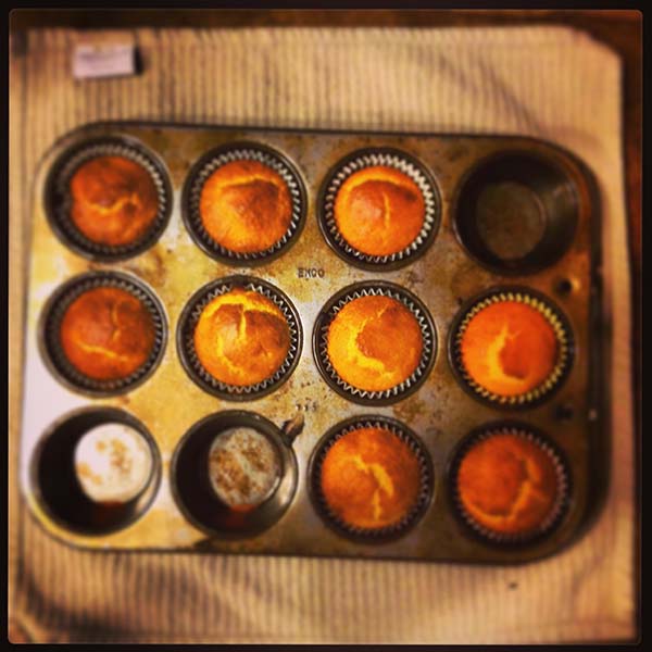
CANDID PHOTOGRAPHY AND FILTERED PHOTOGRAPHY
Photography with the candid or snapshot look is also trending. This aesthetic is created through using “real” people instead of professional models and amateurish compositions. Even if professional models are used, they are staged and photographed to appear spontaneous. The final picture is devoid of professional photography’s perfectly staged lighting and composition.

Candid photography: Enlarge
Inspiring this new aesthetic is the increasing popularity of low-tech, fixed-focus, plastic cameras and the popularity of the camera phone app Instagram. Here’s a breakdown of the elements borrowed from these sources:
The use of cheap, plastic, fixed-focus film cameras, (often referred to as lomography) produces images that are unpredictable in terms of image quality and composition. It’s all about randomness.
-
Since film cameras only allow one chance to get a shot (unless you’re willing to pay for a lot of film), you may end up with a composition that’s not as intended; you lacked adequate time to frame the shot. Part of the lomography “manifesto” is shooting from the proverbial hip.
-
Another characteristic of lomography that is inspiring current photography trends are the unpredictable “mutations” of the photographic image due to the cheap plastic. One mutation is “vignetting,” an out-of-focus distortion that increases toward the edges of the image. Color mutations can also occur. The colors are distorted in an unpredictable, uneven fashion lending further appeal to the analog photographs.
Vignette/filtered photography Enlarge
Instagram is, arguably, the biggest venue people use to share their snapshots. The most popular feature of Instagram is the ability to apply filters to mimic analog photographic styles, such as the hues/saturation one associates with Kodachrome photos from the ‘70s. This allows for personal artistic expression, albeit a prefab version of creativity. Along with the use of real people as models and the snapshot aesthetic, applying filters to photographs is a trend that has leaped outside the boundaries of social media and plastic camera photography and into the realm of graphic design for print and web.
LARGE PHOTOGRAPHIC BACKGROUNDS
In what may seem antithetical to the flat design trend, the use of photography to fill the entire background of the layout is an upward trending design motif. Flat design elements appear to float over the photo on a single plane, thus implying just two flat layers: the photographic background and the design on top.
The photographs are often rendered less dimensional by reducing the color vibrancy, and range. Filters may be applied, rendering the image in a near monochromatic palette, and/or the photos maybe blurred to the point that, while the content of each photo is recognizable, they melt into one element visually.
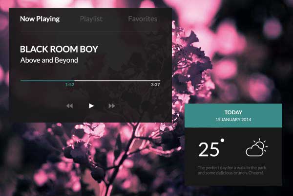
Photographic background: Enlarge
EXPLORE THESE TRENDS FOR YOUR NEXT PROJECT
While flat design and the other approaches are current trends, all probably have peaked or nearing a peak in in popularity. However, don’t be reluctant to incorporate them. Design trends evolve rather slowly. In addition, many of the visual aspects of flat design, in particular, are based on sound decisions to achieve simplicity, ease-of-use and clearly defined structural elements for content.